Data Visualization "Before n' After" - President Trump Liberation Day Announcement
"Before n' After" is a series where we showcase how Data Visualization can enhance your communication and delivery of the key message
DATA VISUALIZATION
5/25/20251 min read

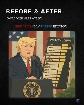
President Donald Trump caused a stir on April 2nd, his so-called Liberation Day, announcing reciprocal tariffs.
While there were huge debates about the calculation method used to come up with tariff rates, whether tariffs will derail global trade, and so on - this post is not about any of that.
While everyone was busy discussing the impacts of tariffs, I noticed another element that no one was talking about…
The president was using a form of data visualization by showing a cardboard table!
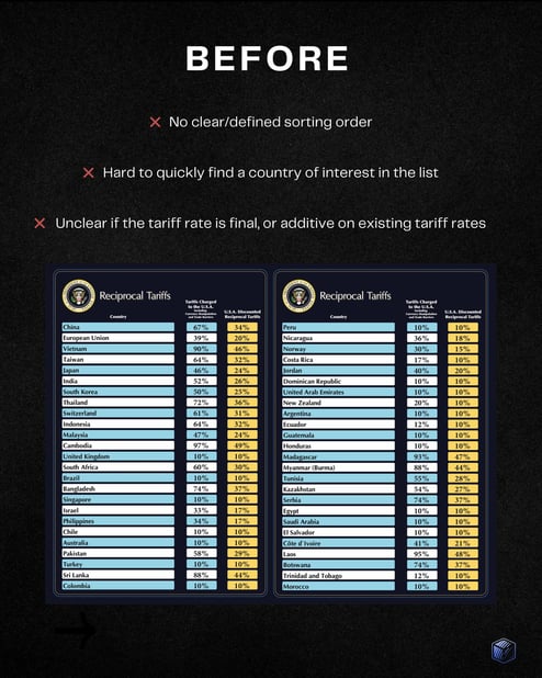
While the idea commended kudos for trying to simplify a complex topic with a table, the execution fell a bit short, which likely caused more questions than answers afterwards:
No clear/defined sorting order
Hard to quickly find a country of interest in the list
Unclear if the tariff rate is final, or additive on existing tariff rates
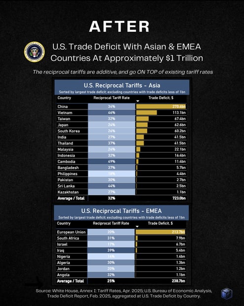
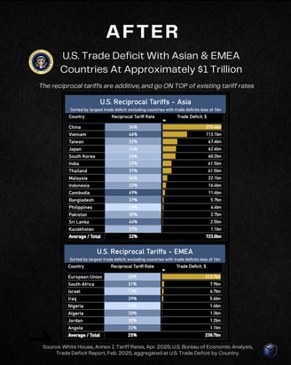
This time I avoided making any major changes intentionally, to show just how a few minor changes and notes can clarify the key message and allow the reader to digest it in a much more efficient manner.

Fraction of your time
Fraction of your cost
ALL The Benefits
Copyright 2024 © FractionBI
MB Smart Funding lt