Data Visualization "Before n' After" - Huberman Podcast
"Before n' After" is a series where we showcase how Data Visualization can enhance your communication and delivery of the key message
DATA VISUALIZATION
4/24/2025
Everybody, or almost everybody has heard of Dr. Andrew Huberman.
Doc provides great, evidence-based information and insights relating to human health on the Huberman Lab podcast.
However, these podcasts are lengthy, to say the least, it’s not uncommon for an episode to go over 2 hours.
Since I’m personally a fan of the podcast and Dr. Huberman, I was looking for a way to get the actionable parts of the podcast in a summarized manner.

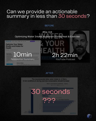

AI so far hasn’t been great in my personal experience, as it does not have the ability to distinguish what’s actually important to highlight and summarize, often leaving some of the key things out. While the Huberman Lab newsletter does a fairly good job of this, it can still get lengthy at times.
So I thought to myself, can data visualization be a way out?
If you’re looking for additional context, underlying mechanisms or a deeper explanation of a topic, then the podcast or the newsletter versions are the way to go.
But if sometimes you just want the key takeaways? Data visualization can do the trick nicely, in 30 seconds or less! And it’s also easy to distribute or use a reference.


Fraction of your time
Fraction of your cost
ALL The Benefits
Copyright 2024 © FractionBI
MB Smart Funding lt